Societal fatality risk levels
So far I have discussed risks to individuals. When we consider hazards that put large groups of the population at risk at the same time, we can use the concept of 'societal risk'.
Societal risk is about assessing the relative importance of events that may kill large numbers of people. Consider this: Which is more acceptable-to have an individual fatality risk of 1 x 10 - 3 for a given hazard, or to have a fatality risk to a group of 1000 of 1 x 10 - 6 for another hazard? If the method for determining these risk levels is accurate, then the same number of people would be killed in the long run. But it is usually considered less acceptable to have a risk for large groups of people that averages out to be the same as the risk for individuals, even though mathematically the same number of people are at risk. This is because we accept that it is a fact of life for individuals to be harmed every day, but large numbers of people being harmed in one hit is more newsworthy and causes more concern.
We can illustrate the degree of risk to various numbers of people for a particular hazard as a societal risk curve , and Figures 4.2 and 4.3 are such curves. You should note that Societal risk curves may also be called 'F/N' or 'f:N' curves. Figure 4.3 shows a number of risk curves for human-caused hazards in the USA .
Note: rather than plot probability values (0-1) on the vertical axis, a related measure of probability, modified 'frequency' is used - the scale relates to the number of events per year with consequences greater than X. This scale, and the values used can be confusing-don't worry about it! It's what the graphs show that is important.
Study Figure 4.2 and you will notice some interesting points.
Firstly, there has been more fear of nuclear power than say dam failure, but the risk curve for nuclear power plants indicates that death through these installations is 1000 times less likely than through dam failure. Secondly, although there has been an outcry about accidents at air shows that have killed people on the ground, the total risk from all aircraft crashes is 10 times greater. You should also note that the curve for nuclear power plants is theoretical (i.e. based on calculations and not experience) as the US has not experienced any nuclear events that have caused 100 or 1000 deaths, whereas the other curves are empirical, i.e. based on real data from actual events.
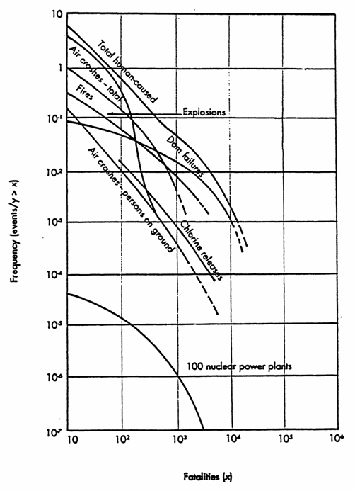
Figure 4.2
Societal risk curves for some human-caused events in the USA
Figure 4.3 shows the societal risk levels to three major types of disasters:
-
natural disasters;
-
transportation disasters;
-
industrial /fire disasters.
The vertical axis on the left hand side shows the actual number of events that have occurred world-wide, and the corresponding number of fatalities.
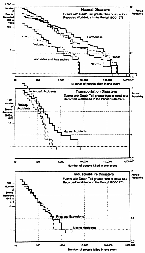
Figure 4.3
Societal risk curves for various disaster types